Hierarchical forecasting of hospital admissions
Introduction
The aim of this series of blogs is to do time series forecasting with libraries that conform to tidyverse principles and there are two of these time series meta-packages
modeltimewhich is created to be the time series equivalent oftidymodelsfpp3which is created to do tidy time series and has been nicknamed thetidyverts. Modelling can be done withfpp3but it is limited to sequential models and mostly uses classical forecasting approaches.
The dataset is monthly admission to Singapore public acute adult hospitals.
Singapore’s hospitals are grouped into three healthcare clusters based on geographical region.
The hospital network in the west is known as National University Hospital System (NUHS) and it has three acute hospitals, Alexandra Hospital (AH); National University Hospital (NUH); Ng Teng Fong General Hospital (NTFGH).
The hospital group in the north is known as National Healthcare Group (NHG) and it has two acute hospitals, Tan Tock Seng Hospital (TTSH); Khoo Teck Puat Hospital (KTPH).
The healthcare cluster in the south and east is known as SingHealth System (SHS) and it has it has three acute hospitals, Changi General Hospital (CGH); Sengkang Hospital (SKH); Singapore General Hospital (SGH).
The dataset starts from Jan 2016 and ends in Feb 2021. 2016 was selected as the starting point as the number of hospitals in 2015 varied (NGTFH opened in end Jun 15 and AH closed from end Jun to Aug 15). Moreover, the time series would have more than 4 years of observations, which should be adequate for time series forecasting. Feb 21 was selected as the end point as that was the latest data available.
library(tidyverse)

raw<- read_csv("https://raw.githubusercontent.com/notast/hierarchical-forecasting/main/stat_sg.csv", na= "na", skip=4, n_max=9) %>%
  select(-X64) %>%
  # remove *
  mutate(Variables= str_remove(Variables, " \\*")) %>%
    # remove Public Sector Hospital Admissions, the value is inaccurate, likely it included children's and mental hospitals
  filter(Variables != "Public Sector Hospital Admissions") %>%
  # longer
  pivot_longer(-Variables, names_to="Date", values_to="Admission") %>%
  # convert date format
  mutate(Date=parse_date(Date, "%Y %b")) %>%
  # short hand
  mutate(Variables= recode(Variables, # recode old=new
  `Alexandra Hospital` = "AH",
  `Changi General Hospital` = "CGH", `Khoo Teck Puat Hospital` = "KTPH",
  `National University Hospital` = "NUH", `Ng Teng Fong General Hospital` = "NTFGH",
  `Sengkang General Hospital` = "SKH", `Singapore General Hospital` = "SGH",
  `Tan Tock Seng Hospital`= "TTSH")) %>%
  # cluster
  mutate(Cluster= case_when(
    Variables %in% c("CGH", "SKH", "SGH") ~ "SHS",
    Variables %in% c("NUH", "AH", "NTFGH") ~ "NUHS",
    Variables %in% c("TTSH", "KTPH") ~ "NHG")) %>%
  # rename
  rename(Hospital= Variables)
# export clean dataset for future posts
stat_sg_CLEAN<- write.csv(raw, file = "state_sg_CLEAN.csv")# recalculate total hospital admissions
df<-raw %>% group_by(Date) %>% summarise(Admission=sum(Admission, na.rm = T)) %>% mutate(Cluster= "National", Hospital= "National") %>% bind_rows(raw)
df_cluster<- df %>% group_by(Cluster, Date) %>% summarise(Admission= sum(Admission, na.rm = T), .groups= "drop") Visualization
The agenda for this post is EDA before forecasting is attempted. In general, I found modeltime’s timetk package as a more useful visualization package than fpp3’s fable package. Refer to this blog post for time series visualization using timetk and fpp3 and fpp3’s ancestor, fpp2. modeltime uses tibble while fpp3 uses their own unique tidyvert’s time series data format, tsibble. When converting to tsibble format, I learnt that we need to explicitly state the temporal increment (e.g. monthly, weekly) for the time index of the time series.
library(fpp3)
library(timetk)

df_tsib<- df %>%
  # monthly index- https://stackoverflow.com/questions/59538702/tsibble-how-do-you-get-around-implicit-gaps-when-there-are-none
  mutate(Date= yearmonth(as.character(Date))) %>%
  # if there are two index, need to use group_by and summarise to isolate a specific index
  # https://www.mitchelloharawild.com/blog/feasts/
  as_tsibble(key= c(Hospital), index= Date)
There are at least 5 concepts that we should visualize before forecasting a time series:
- Trend
- Seasonality
- Anomaly (which is based off the remainder from STL decomposition)
- Lags (which is the foundation for autocorrelation and partial autocorrelation)
- Correlation of time series features
Hospital level data was visualized with all the above concepts while cluster level data was visualized when it was appropriate. Abbreviations of the hospital and cluster names were used to keep the plots neat. The grand total admission is labelled as National at hospital level and is labelled as National at cluster level.
1. Trend
Trend refers to the long-term increase or decrease in the data, it indicates any changing direction of the data
- In general, there was an increase in the number of admission till first half of 2020 during the peak of the COVID-19 pandemic. After the peak, admissions to KTPH and NTFGH did not increase to pre peak numbers.
- The number of admissions to SKH markedly increase during 2018 as the new hospital fully opened its entire hospital campus.
- The variation in the time series does not appear to increase or decrease with time, transformations were held off.
df %>% group_by(Hospital) %>% plot_time_series( Date, Admission, .interactive = F, .legend_show = F, .facet_ncol = 3, .title="Time Series (hospital level)")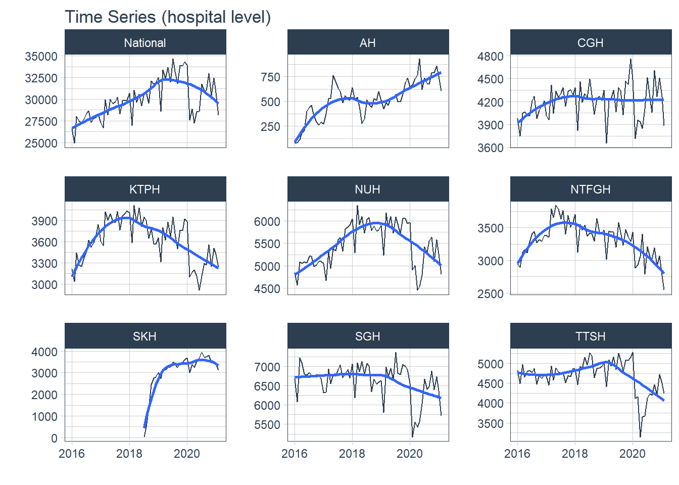
df_cluster %>% group_by(Cluster) %>%
plot_time_series( Date,  Admission,  .interactive = F, .legend_show = F, .facet_ncol = 2, .title= "Time Series (cluster level)")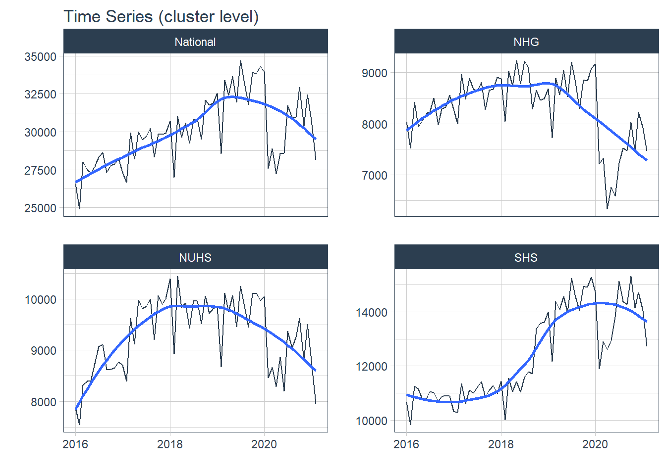
2. Seasonality
Seasonality allow us to view patterns over time and identify time periods in which the patterns change.
timetk’s plot_seasonal_diagnostics is a convenient function to plot the observations by month, year and quarter. Unfortunately, it has limited flexibility to adjust the aesthetics and the plots can be overcrowded.
df%>% group_by(Hospital) %>% plot_seasonal_diagnostics(Date, Admission, .interactive=F, .feature_set="month.lbl")## Warning: Removed 30 rows containing non-finite values (stat_boxplot).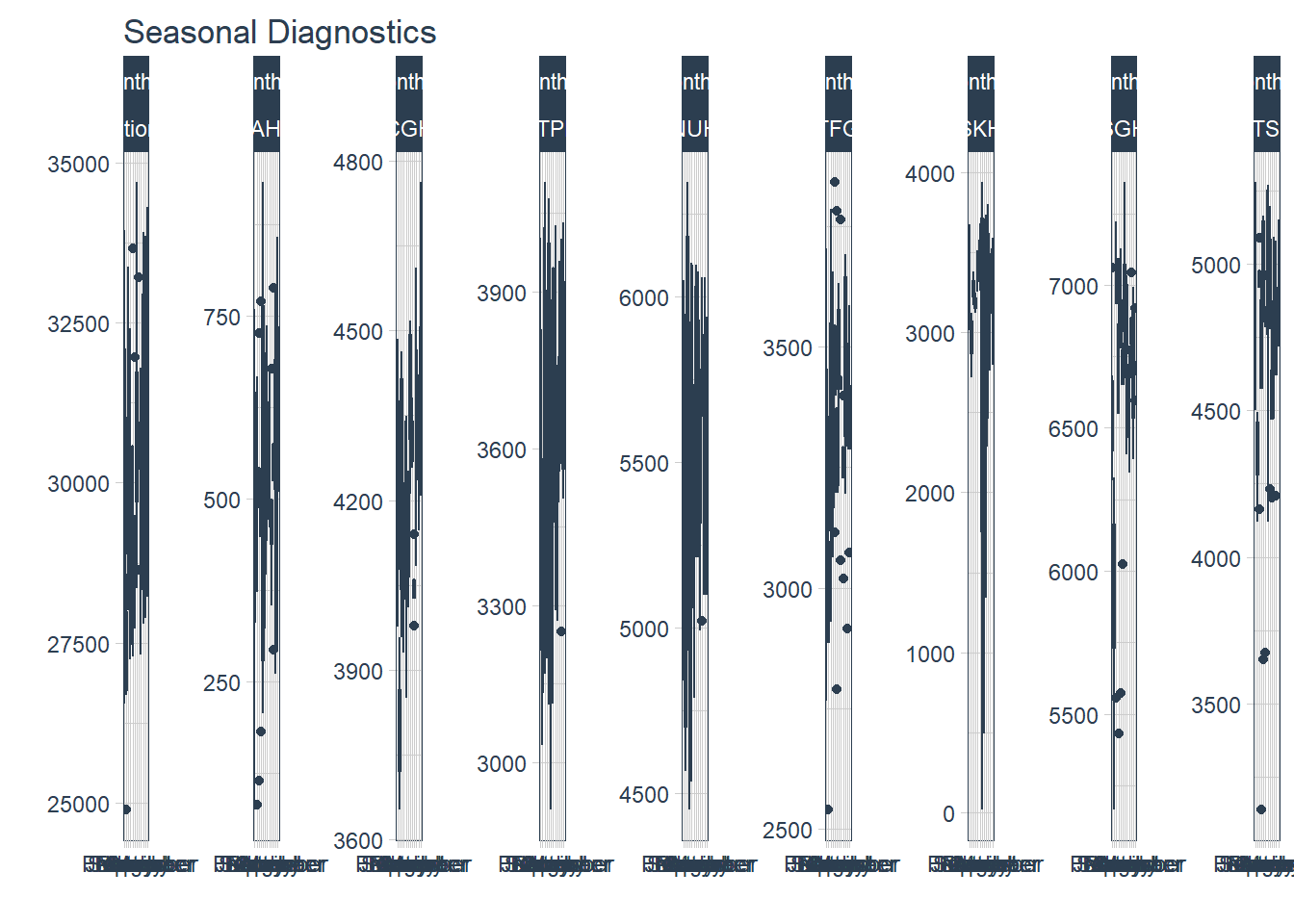
feasts’s has gg_season to plot seasonal graphs.
- There are fewer admissions in Feb.
df_tsib %>%
    gg_season(Admission, period="year")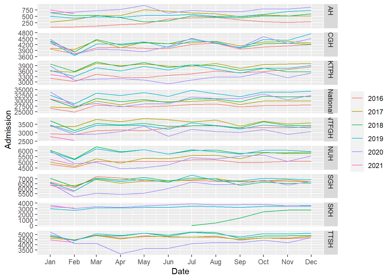
However, I could not change the temporal granularity.
df_tsib %>% gg_season(Admission, period="month")## Error: The data must contain at least one observation per seasonal period.Additionally, I wanted outliers to be highlighted which would have been easier with box plots like in timetk::plot_seasonal_diagnostics. I created plots similar to timetk::plot_seasonal_diagnostics but allowed faceting for better aesthetics.
- Again, fewer admissions in Feb is seen, likely for two reasons. Firstly, Feb has the shortest month and Chinese Lunar New Year tends to happen during Feb.
- There are more admissions in the final quarter of the year, mostly from Oct and Dec.
#https://stackoverflow.com/questions/59142181/passing-unquoted-variables-to-curly-curly-ggplot-function
#https://stackoverflow.com/questions/59095237/automate-ggplots-while-using-variable-labels-as-title-and-axis-titles?noredirect=1&lq=1- need to use paste for title
fun_season<- function(dat, var, f, t){
  ggplot(dat, aes(!!{{var}}, Admission))+ geom_boxplot() + facet_wrap(vars({{f}}), scales = "free_y") +scale_x_discrete(guide = guide_axis(angle = 45)) + labs(title= paste(var, t))}

c("Year", "Quarter", "Month") %>% syms() %>%
  map(., ~fun_season(
    dat= df %>% mutate(Year= as.factor(year(Date)),
              Quarter= as.factor(quarter(Date)),
              Month= as.factor(month(Date))),
.x, Hospital, "Seasonality (hospital level)"))
## [[1]]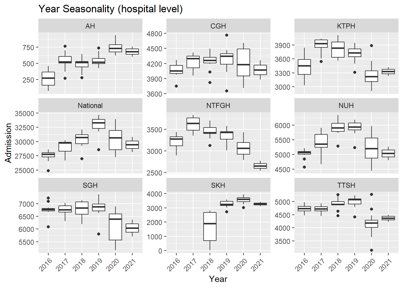
##
## [[2]]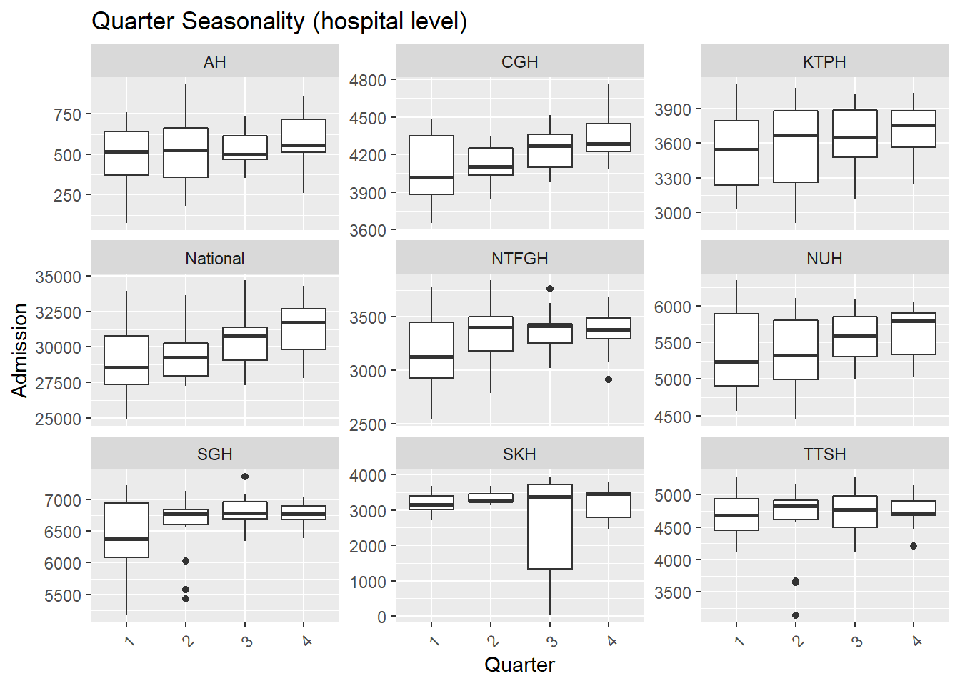
##
## [[3]]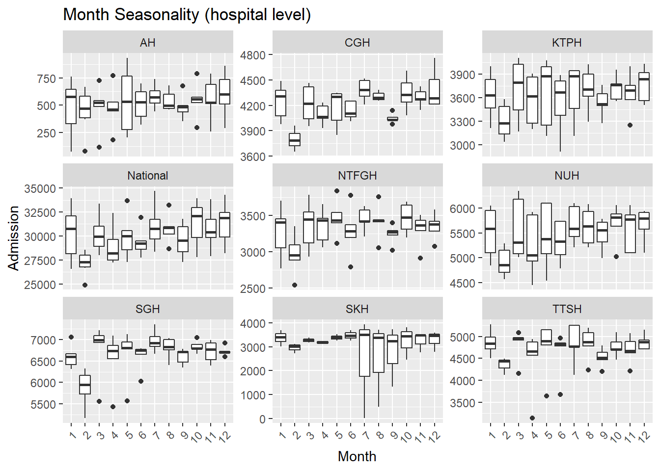
c("Y", "Q", "M") %>% syms() %>%
  map(., ~fun_season(
    dat= df_cluster %>% mutate(Y= as.factor(year(Date)),
              Q= as.factor(quarter(Date)),
              M= as.factor(month(Date))),.x, Cluster, "Seasonality (cluster level)"))
## [[1]]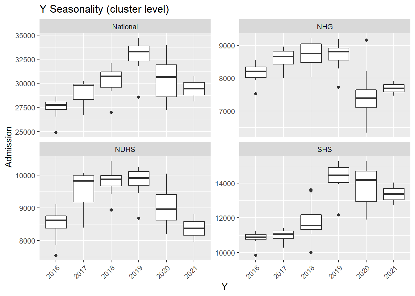
##
## [[2]]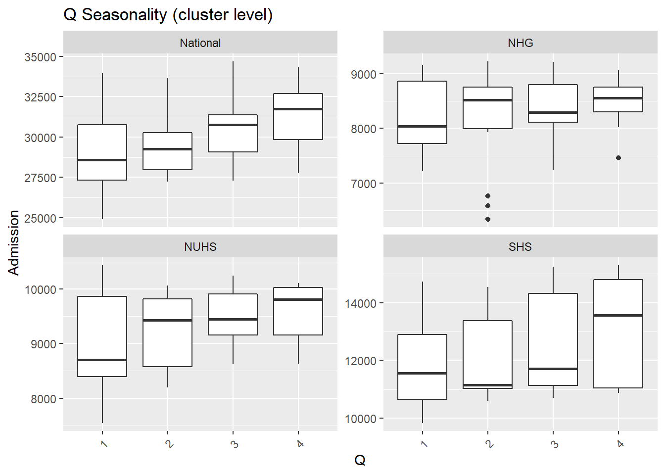
##
## [[3]]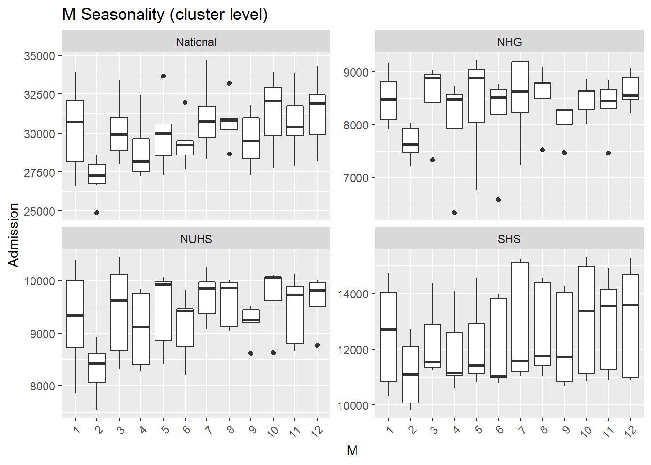
A useful summary plot covering various temporal granularity was achieved with gg_subseries.
- The low admission during Feb is more obvious in this plot as the horizontal blue line highlighted the mean.
df_tsib %>%gg_subseries(y=Admission) 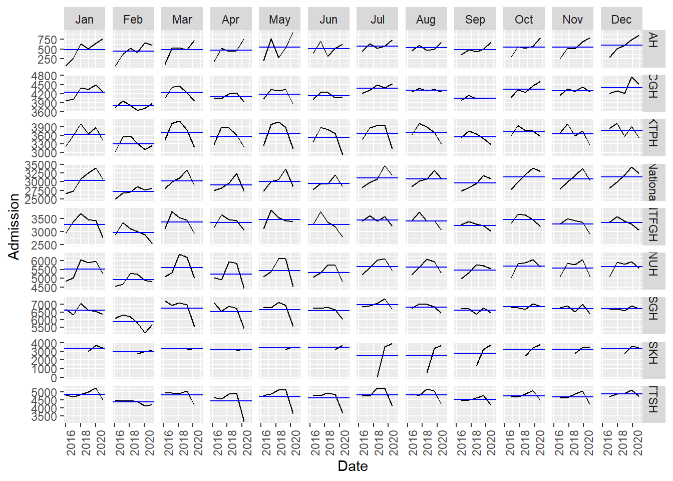
Trend and seasonality
A more objective manner to determine trend and seasonality to use to values from STL, more specifically trend_strength and seasonal_strength_year. 0 implies weak strength while 1 implies 1 strong strength. Afpp3 package, fabletools, calculates STL values from the feasts package and outputs it into a dataframe. I piped the output into a plot.
- Hospitals have less than moderate seasonality, with CGH having the highest seasonal strength of 0.66.
- CGH has the lowest trend strength which is also observed in the trend plot at the start of the post where CGH has a flat loess line. SKH has the highest trend strength which is also observed in the very first plot where SKH had a steep loess line.
df_tsib  %>%   features(Admission, feature_set(tags = "stl")) %>%  ggplot(aes(x=trend_strength, y=seasonal_strength_year, col=Hospital, label=Hospital)) +
    geom_point() +
geom_text( check_overlap=T, hjust=1, vjust=1)+
   scale_x_continuous(limits = c(0, 1)) +  scale_y_continuous(limits = c(0, 1))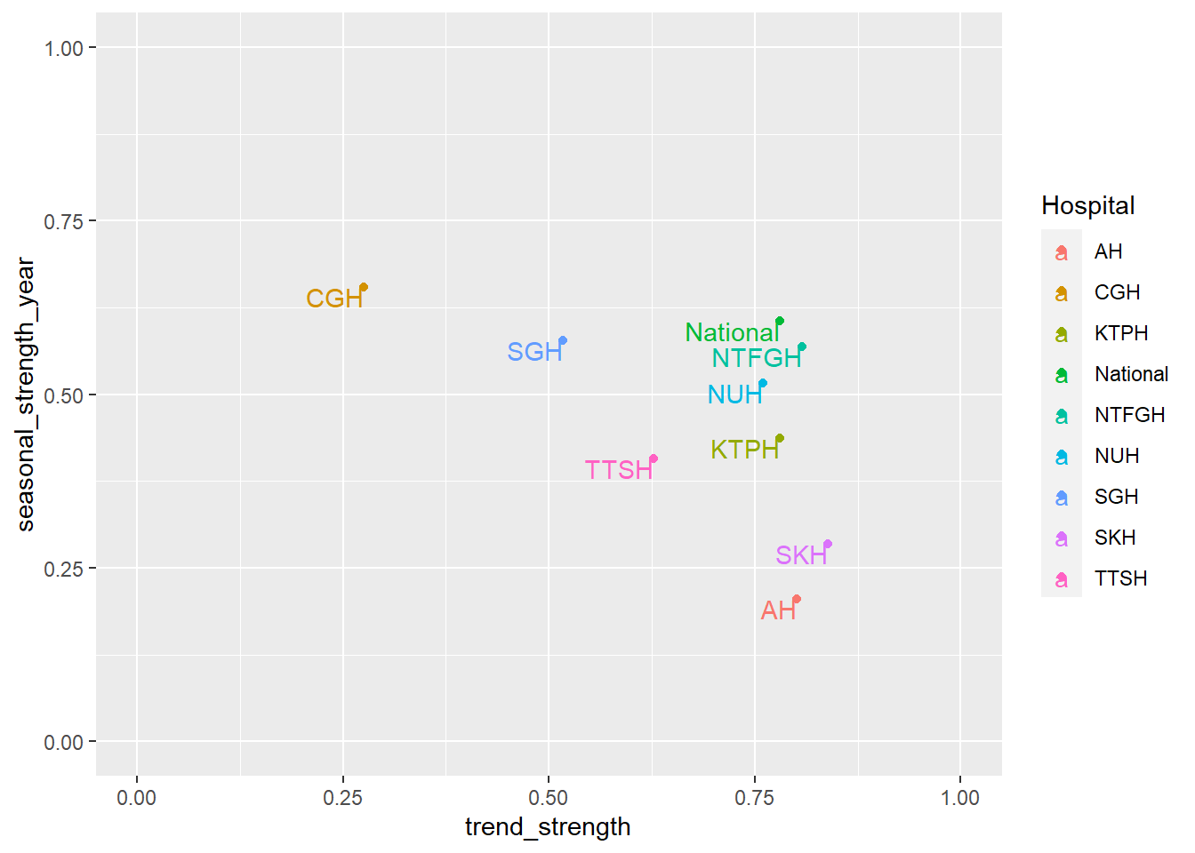
3. Anomaly
timetk has a useful function to flag up anomaly observations, plot_anomaly_diagnostics.
df %>% mutate(Admission=replace_na(Admission, 0)) %>%  # need to replace NA or calculation error
  group_by(Hospital) %>%
  plot_anomaly_diagnostics(.date_var = Date, .value= Admission, .facet_ncol=3, .facet_scales="free_y", .ribbon_alpha=.25, .message=F, .legend_show=F, .title= "Anomaly (hospital level)", .interactive=F)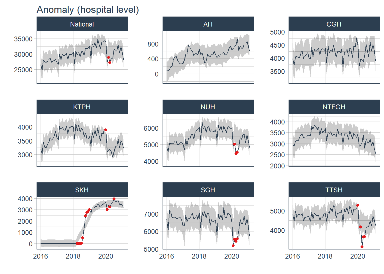
df_cluster %>% group_by(Cluster) %>%
  plot_anomaly_diagnostics(.date_var = Date, .value= Admission, .facet_ncol=3, .facet_scales="free_y", .ribbon_alpha=.25, .message=F, .legend_show=F, .title= "Anomaly (cluster level)", .interactive=F)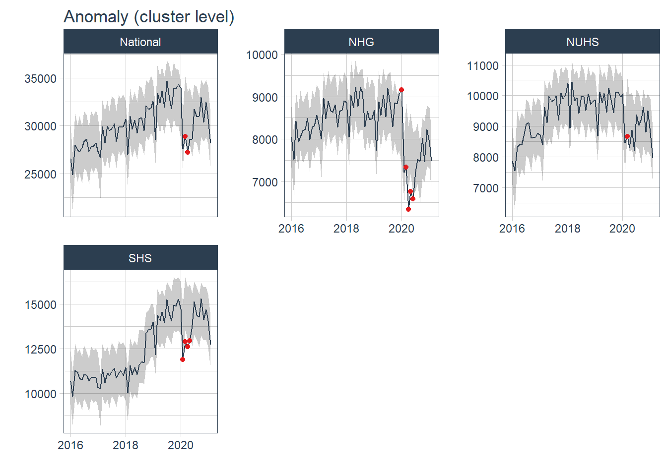
Most of the anomaly detected occurred during the peak of COVID19 pandemic from Jan 20- Jul 20. The anomaly in 2018 came from SKH and was not observed in other hospitals nor at a more aggregated cluster level. The anomaly was likely due to the change in the number of admissions before and after the hospital was opened in Jul 18.
df %>% mutate(Admission=replace_na(Admission, 0)) %>% group_by(Hospital) %>% tk_anomaly_diagnostics(.date_var = Date, .value=Admission) %>% ungroup() %>% filter(anomaly== "Yes") %>% count(Date, sort=T)## # A tibble: 16 x 2
## Date n
## <date> <int>
## 1 2020-04-01 5
## 2 2020-03-01 4
## 3 2020-05-01 3
## 4 2020-01-01 2
## 5 2020-02-01 2
## 6 2018-04-01 1
## 7 2018-05-01 1
## 8 2018-06-01 1
## 9 2018-07-01 1
## 10 2018-08-01 1
## 11 2018-10-01 1
## 12 2018-11-01 1
## 13 2018-12-01 1
## 14 2019-01-01 1
## 15 2020-06-01 1
## 16 2020-07-01 1Conclusion
EDA revealed that there was an upward trend of admissions till the first half of 2020 which was flagged up as anomaly observations. A dummy variable for this heightened COVID19 period would be considered when forecasting. Seasonality varied though a dipped in admissions during Feb was common, this observation should be included when forecasting. The EDA would be completed in the next post.