Process Mining (Part 3/3): More analysis and visualizations
Intro
A week ago, Havard Business Review published an article on process mining and provided reasons for companies to adopt it. If you need a refresher on the concepts of process mining, you can refer to my first post. Conducting process mining is easy with R’s bupaR package. bupaR allows you to create a variety of visualizations as you analyse event logs. It includes visualizations of workflow on the ground which you can then compare them against theoretical models to discover deviations. However, there are some analysis and visualizations which are not included in bupaR. I will cover these in this last post on process mining. (The datasets used in this post are healthcare related.)
Interpruption Index
The interruption index measures how much does a resource have to toggle between cases before completing the case instead of completing all the activities for a case before proceeding to the next case. The toggling between incomplete cases could be due to many reasons. However, if the reason is due to disruptions in the workflow, it will result in inefficiency and lost in productivity. (If there is a proper term for what I’m doing, please let me know in the comments below)
Index components
The interruption index is a ratio of two parameters, time block and case load.
Time block is where all the activity instances executed by a specific resource are arranged in chronological order within a defined time. For this post, it will be a day. The consecutive activity instances for a particular case are grouped together to form a time block. In the example below, there are four time blocks.
| Activity | Resource | Time | Day | Case | Time Block |
|---|---|---|---|---|---|
| Admission | Z | 10:40 | 1 | AA | 1 |
| Admission | Z | 11:11 | 1 | BB | 2 |
| X-ray | Z | 11:30 | 1 | BB | 2 |
| X-ray | Z | 12:00 | 1 | AA | 3 |
| Scans | Z | 12:44 | 1 | AA | 3 |
| Pre-op | Z | 13:59 | 1 | BB | 4 |
The caseload component in the ratio refers to the maximum number of cases seen by a specific resource on a particular day. In the example above, there is a maximum of 2 cases. Hence, the ratio is 2 (4/2= 2). The lowest score is 1 which means there is no toggling between cases and the day is the least interrupted.
Calculating the index
I will be using the sepsis eventlog from the bupaR package to illustrate the interprution index.
There are 26 resources providers in the dataset but we will only compare the index between 2 resources for simplification purposes.
# library
library(plyr)
library(tidyverse)
library(bupaR)
theme_set(theme_light())

n_resources(sepsis)
## [1] 26Let’s do some wrangling to derive a dataframe which we will work with.
#derive desired df
sepsis_df<-sepsis %>% filter_resource(c("A", "B")) %>%  # filter 2 resources for our example
data.frame() %>% # convert event log object
select(case_id, activity, lifecycle, resource, timestamp) %>% # select relevant variables
  drop_na() #drop na observation
In this post the timeframe for the index is a day so we will create a day identifier, ID_day. The index requires us to calculate the caseload for each day for each resource.
sepsis_df<-sepsis_df %>% mutate(Date= as.Date(timestamp)) %>% mutate("ID_day" = group_indices_(., .dots = c("resource","Date"))) %>% # add ID_day
  group_by(ID_day) %>% arrange(ID_day, timestamp) %>% select(resource, ID_day, case_id) %>%
mutate(caseload = n_distinct(case_id)) %>% # caseload
  ungroup()

sepsis_df %>% head()
## # A tibble: 6 x 4
## resource ID_day case_id caseload
## <fct> <int> <chr> <int>
## 1 A 1 XJ 1
## 2 A 1 XJ 1
## 3 A 1 XJ 1
## 4 A 1 XJ 1
## 5 A 2 WEA 1
## 6 A 2 WEA 1We now calculate the timeblock and then the interuption index.
#remove duplicate rows
ix <- c(TRUE, rowSums(tail(sepsis_df, -1) == head(sepsis_df, -1)) != ncol(sepsis_df))
sepsis_df<-sepsis_df[ix,]
#transpose case_id column
sepsis_df <- ddply(sepsis_df, .(ID_day), transform, idx = paste("TB", 1:length(case_id), sep = ""))  %>% spread(idx, case_id)
#calculate timeblocks
sepsis_df<-sepsis_df %>%  mutate(timeblock = rowSums(!is.na(select(.,starts_with("TB"))))) %>% select(-starts_with("TB")) # remove reduntanct TB variables
#calculate index
sepsis_df$interupt_index<-sepsis_df$timeblock/ sepsis_df$caseload
# sample size of index for each resource
sepsis_df<-sepsis_df %>% add_count(resource, interupt_index)

head(sepsis_df)
## # A tibble: 6 x 6
## resource ID_day caseload timeblock interupt_index n
## <fct> <int> <int> <dbl> <dbl> <int>
## 1 A 1 1 1 1 282
## 2 A 2 1 1 1 282
## 3 A 3 1 1 1 282
## 4 A 4 1 1 1 282
## 5 A 5 2 5 2.5 2
## 6 A 6 1 1 1 282Visualizing the index
sepsis_df %>% ggplot(aes (interupt_index, n, size=n)) + geom_point() + facet_grid(~resource)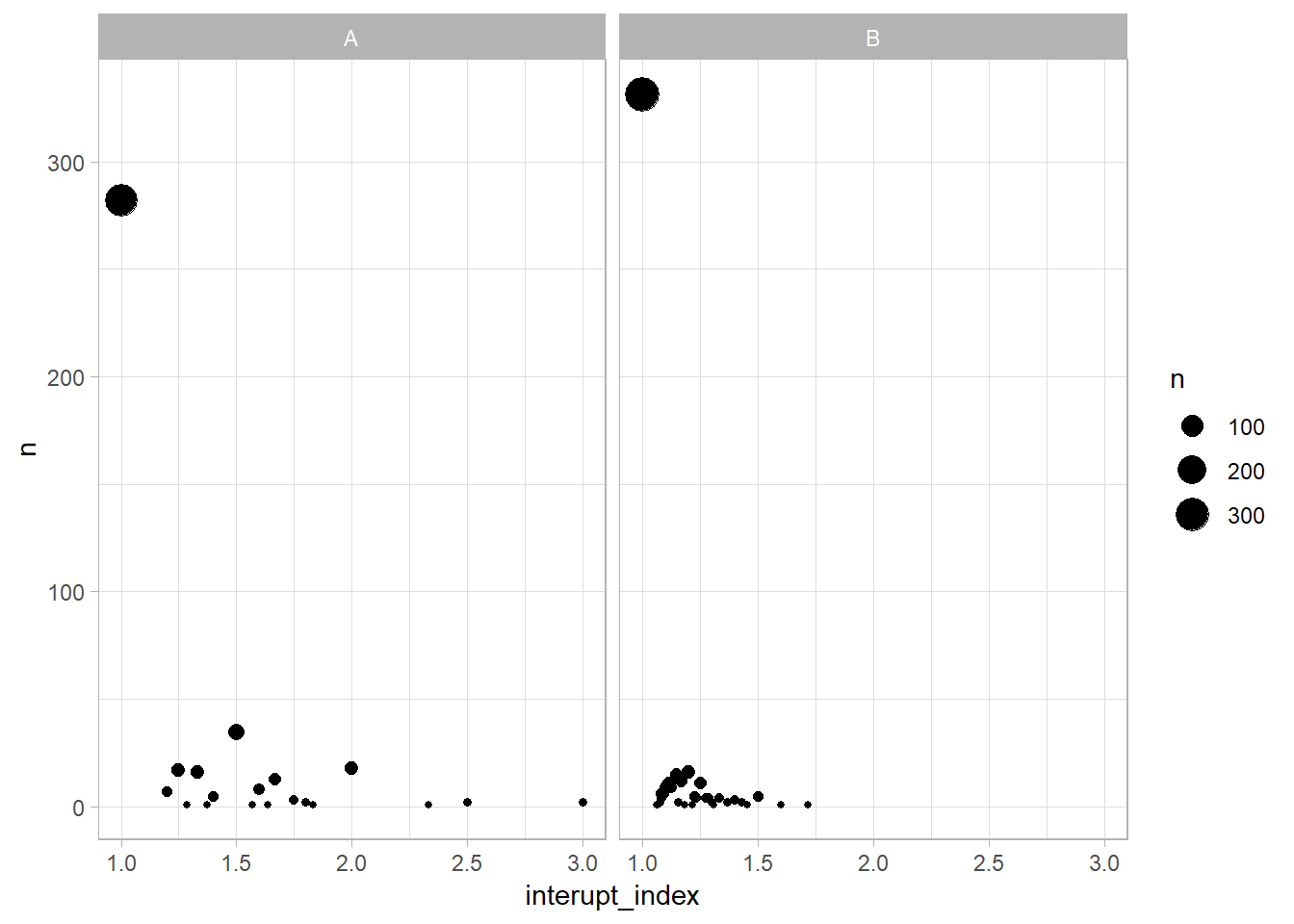 Let’s plot the interruption index for Resource A and Resource B. Resource A and Resource B experienced an interruption index of 1 on most days. In other words, they completed all the activities for a specific case before moving to the next case. Resource B has more days with an index of 1 than Resource A. There is a greater variation of the interruption index for Resource A, with a maximum ratio of 3.
Timeseries Heatmap
bupaR has many fantastic built in functions to create various visualizations to address different questions on workflow. Unfortunately, bupaR does not have a function to create a time series heat map. I find time series heat map useful to identify peak and lull periods for each activity. Discovering peak periods allow managers to allocate more resources to prevent accumulation of bottlenecks. Understanding lull periods can free up excess capacity.
Data wrangling
We will use a different dataset, patients, to demonstrate how to create a time series heat map from an event log.
The patients dataset is an event log of a series of activates conducted when patients are admitted till they are discharged. However, the current factor levelling for the activity variable, handling is not reflective of an expected workflow when patients are admitted. For instance, “Blood test” is the first activity and “Registration” is the fifth activity.
patients_df<-data.frame(patients)  #convert the `eventlog` object to a `dataframe` object

levels(patients_df$handling)
## [1] "Blood test" "Check-out" "Discuss Results"
## [4] "MRI SCAN" "Registration" "Triage and Assessment"
## [7] "X-Ray"We’ll need to relevel the activities in handling to a sequence likely seen in a hospital admission.
patients_df<-patients_df %>% mutate(handling= fct_relevel(handling, "Registration", "Triage and Assessment", "Blood test", "X-Ray", "MRI SCAN", "Discuss Results", "Check-out"))

levels(patients_df$handling)
## [1] "Registration" "Triage and Assessment" "Blood test"
## [4] "X-Ray" "MRI SCAN" "Discuss Results"
## [7] "Check-out"Ploting the heatmap
Traditionally, I will use the plasma colour palette in scale_fill_viridis_c for heatmaps. However, since I encountered this TidyTuesday tweet, I have adopted the Zissou1 colour palette from the wesanderson package for my heatmaps.
patients_df %>% dplyr::mutate(
time= format(time, format = "%H:%M:%S") %>% as.POSIXct(format = "%H:%M:%S"), #standardized the date for ploting
hour= lubridate::floor_date(time, "hour")) %>% # round down time to nearest hour
count(handling, hour) %>% # total instances of each activity at each hour
add_count(handling, wt=n) %>% # total instances of each activity
mutate(percent= ((n/nn)*100)) %>% #relative freq for each activity
ggplot(aes(hour, handling, fill=percent)) + geom_tile(size=.5, color="white") + scale_fill_gradientn(colours = wesanderson::wes_palette("Zissou1", 20 ,type = "continuous"))+
theme_classic() +
labs(x="24hour Clock", y="", title= "Peak and Lull Period of Patient Activities", subtitle= "percentage calculated is the relative frequency for a specific activity", fill="%") + scale_y_discrete(limits = rev(levels(patients_df$handling)))+ # reverse display of y-axis varaibles
scale_x_datetime(date_breaks = ("1 hour"), date_labels = "%H") #display only 24H clock values 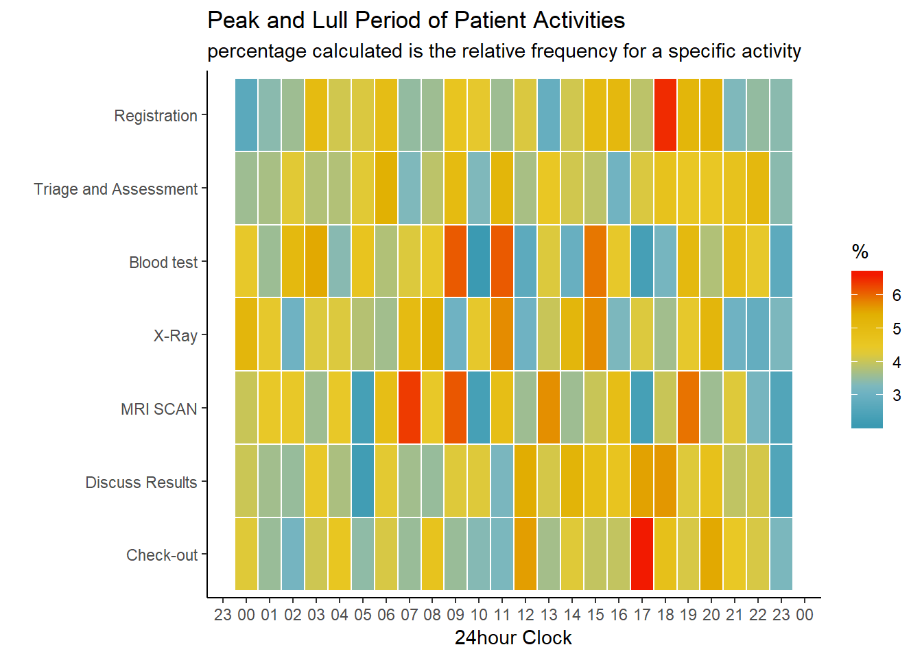 The heatmap reveals that the most common time to check out is 1700hours and the most common time to register is 1800hours. This makes logical sense, as existing patients need to be discharged first before the hospital can admit new patients. There is consecutive alternation between warm and cool colours for the blood test activity from 0900 hours to 1600hours. I hypothesize that the hourly fluctuation is due to insufficient machinery/manpower during office hours. During the lull periods, manpower and machinery are operating at maximum capacity to process blood collected from the previous peak period. There is inadequate machinery/manpower to accommodate more blood test thus less blood test are conducted.
To Sum Up
In this last post on process mining, we look at analysis and visualizations not included in the bupaR package but are still useful in understanding the workflow of business operations. We calculated the interruption index to examine the extend of disruption when a resource attends to a specific case. We also plotted a heat map to visualize busy and quiet periods of the various activities in an event log.